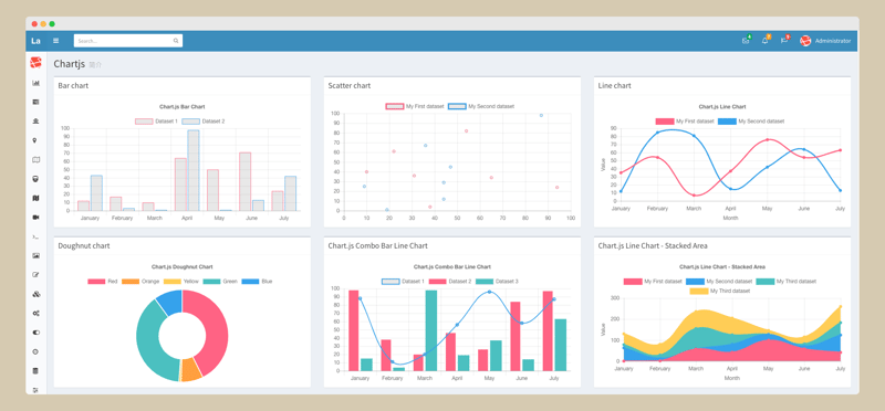
JavaScript charting has evolved into a necessary ability in the realm of current web development for displaying data in an aesthetically pleasing and easily understood manner. Whether you are building dashboards, analytics systems, or stand-alone visualisations, efficiency is essential to making sure your charts run without problems independent of the data complexity or audience number. Emphasising optimisation, clarity, and strong implementation, this paper investigates many techniques for attaining JavaScript charting success.
The Importance of Optimizing Chart Performance
One of the most critical aspects of working with JavaScript charts is ensuring they remain performant, even when handling large datasets or multiple simultaneous interactions. The efficiency of a chart can directly affect the user experience, making it imperative for developers to understand the nuances of optimization.
For starters, minimizing the volume of data displayed at any given time can significantly enhance performance. Techniques such as data aggregation or sampling allow you to summarize datasets without losing essential trends. For example, when charting millions of data points, grouping them into manageable intervals can reduce rendering time and improve responsiveness.
Commentary from a SciChart developer: “When creating JavaScript charts, prioritizing performance from the start saves time and headaches later. Overloading a chart with excessive data points or unnecessary features often leads to slow rendering and poor user experiences. Focus on simplicity, functionality, and scalability for the best results.”
Furthermore, using hardware acceleration through WebGL or similar technologies is a powerful way to boost performance. Many modern JavaScript charting libraries take advantage of WebGL to render complex charts efficiently. This approach leverages the GPU, freeing the CPU for other tasks and ensuring smooth interactivity.
Choosing the Right JavaScript Charting Library
The foundation of successful charting lies in selecting the appropriate library for your project. While there are many JavaScript charting libraries available, not all are suited to every use case. Some libraries excel in rendering simple bar or line charts, while others are built for handling advanced 3D or real-time visualizations.
Key considerations when choosing a library include:
Scalability: Can the library handle large datasets without degrading performance?
Customizability: Does it allow for tailored visualizations that align with your project’s branding and functionality needs?
Ease of Integration: Is the library straightforward to implement within your tech stack?
For instance, if your project involves real-time financial data, a high-performance library with advanced features such as zooming, panning, and live updates is essential. Libraries are often recommended for these scenarios due to their emphasis on speed and interactivity.
Efficient Data Management Practices
Efficient data handling is fundamental to achieving success in JavaScript charting. Poorly structured or overly large datasets can slow down even the most robust charts, so attention to data preparation and organization is vital.
Data preprocessing is one effective strategy. This involves cleaning, transforming, and formatting data before passing it to your charting library. For example, if your dataset includes unnecessary columns or outliers, removing these elements can streamline rendering.
Lazy loading is another valuable technique, especially for applications with dynamic datasets. By loading data incrementally as users interact with a chart, you can avoid overwhelming the browser with excessive information. This approach is particularly useful for scrolling or paginated views.
Creating Clear and Accessible Visualizations
Efficiency isn’t just about speed—it also encompasses clarity and accessibility. A visually cluttered chart, no matter how fast it renders, can fail to communicate its message effectively. Therefore, adhering to best practices for chart design is crucial.
Start by choosing the right chart type for your data. While bar charts are ideal for categorical comparisons, line charts work better for time series data. Misusing chart types can confuse viewers and obscure key insights.
Colour schemes also play a vital role. Avoid using overly complex palettes, and ensure that your charts are colourblind-friendly by including patterns or textures for differentiation. Interactive features, such as tooltips and legends, can further enhance understanding by providing contextual information without overwhelming the initial view.
Accessibility should not be overlooked. Incorporating features such as keyboard navigation, screen reader compatibility, and high-contrast modes ensures that your charts are usable by a broader audience, including those with disabilities.
Leveraging Modern Features and Technologies
JavaScript charting libraries have evolved significantly in recent years, offering a host of advanced features that can streamline development and improve user experience. By staying up-to-date with these tools, developers can create charts that are not only efficient but also innovative.
One example is the use of real-time updates. Applications such as stock market dashboards or IoT monitoring systems require charts to refresh dynamically without reloading the page. WebSockets or server-sent events are common solutions for achieving this functionality.
Another modern trend is the integration of machine learning and predictive analytics. By combining these technologies with charting libraries, you can create visualizations that not only display historical data but also predict future trends. This can be particularly valuable in industries like finance or healthcare, where foresight is critical.
Testing and Debugging Your Charts
Efficient JavaScript charting requires rigorous testing to identify and resolve performance bottlenecks. Profiling tools such as Chrome DevTools or Firefox Performance Monitor can help you analyze rendering times and pinpoint areas for improvement.
It’s also essential to test charts under real-world conditions. Simulating different device types, screen sizes, and network speeds can reveal issues that may not be apparent during development. For instance, a chart that performs well on a high-end desktop may struggle on a mobile device with limited resources.
Logging and error handling are equally important. Ensure that your code is equipped to handle unexpected inputs or interactions gracefully, and log any errors for future troubleshooting. This practice not only improves the reliability of your charts but also simplifies maintenance.
Continuous Improvement Through User Feedback
Finally, success in JavaScript charting is an ongoing process that involves continuous refinement. Soliciting feedback from users can provide valuable insights into how your charts are being used and where they can be improved.
For example, if users consistently struggle to interpret a particular chart, consider simplifying its design or providing additional context. Similarly, if performance complaints arise, investigate whether data volume, rendering techniques, or other factors are to blame.
Regularly revisiting your charts and incorporating user suggestions ensures that they remain relevant, effective, and aligned with your project’s goals.
Conclusion
Mastering JavaScript charting is both an art and a science. By focusing on performance, choosing the right tools, managing data efficiently, and prioritizing clarity, developers can create charts that not only look great but also deliver meaningful insights. Whether you’re building a simple bar chart or a complex, real-time dashboard, following these efficiency tips will set you on the path to success.
As the landscape of JavaScript charts continues to evolve, staying informed about the latest technologies and best practices is essential. With dedication and attention to detail, you can ensure that your charts meet the highest standards of performance and usability, making them valuable assets for any project.


